2019, Portraits

Redrawing Tarja

“Promises mean everything
Life won’t look back for you”

Tarja – Dead Promises

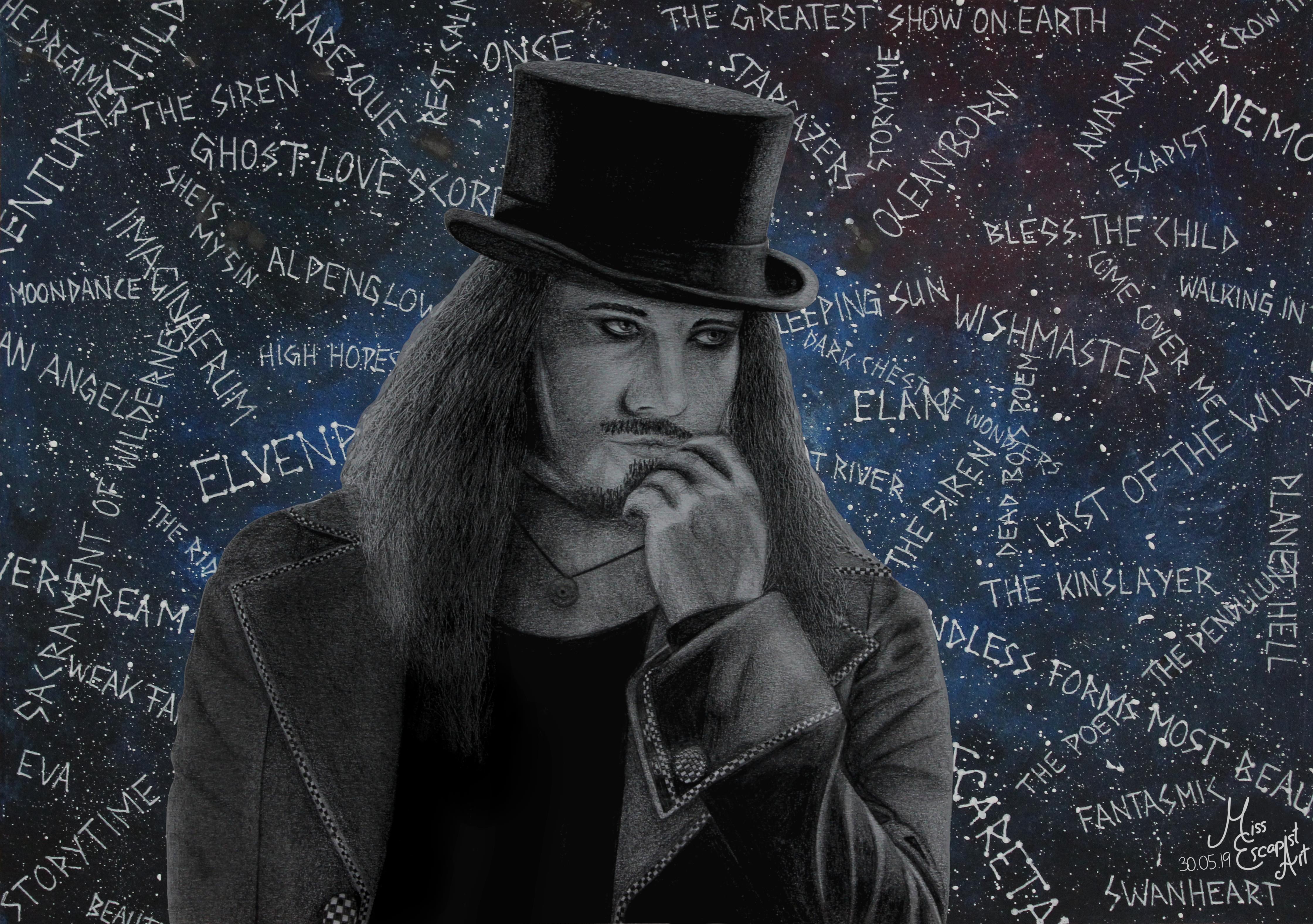
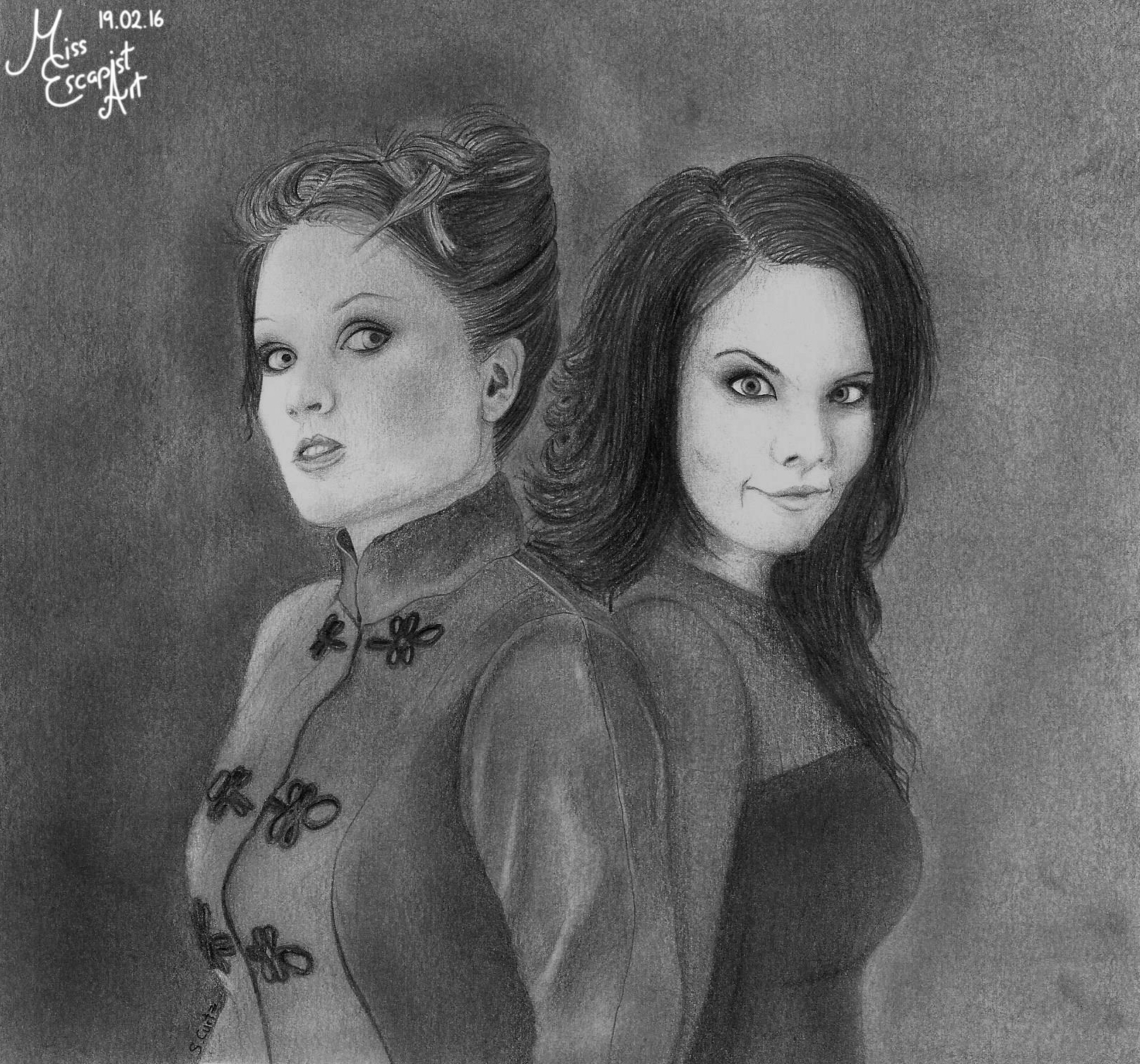
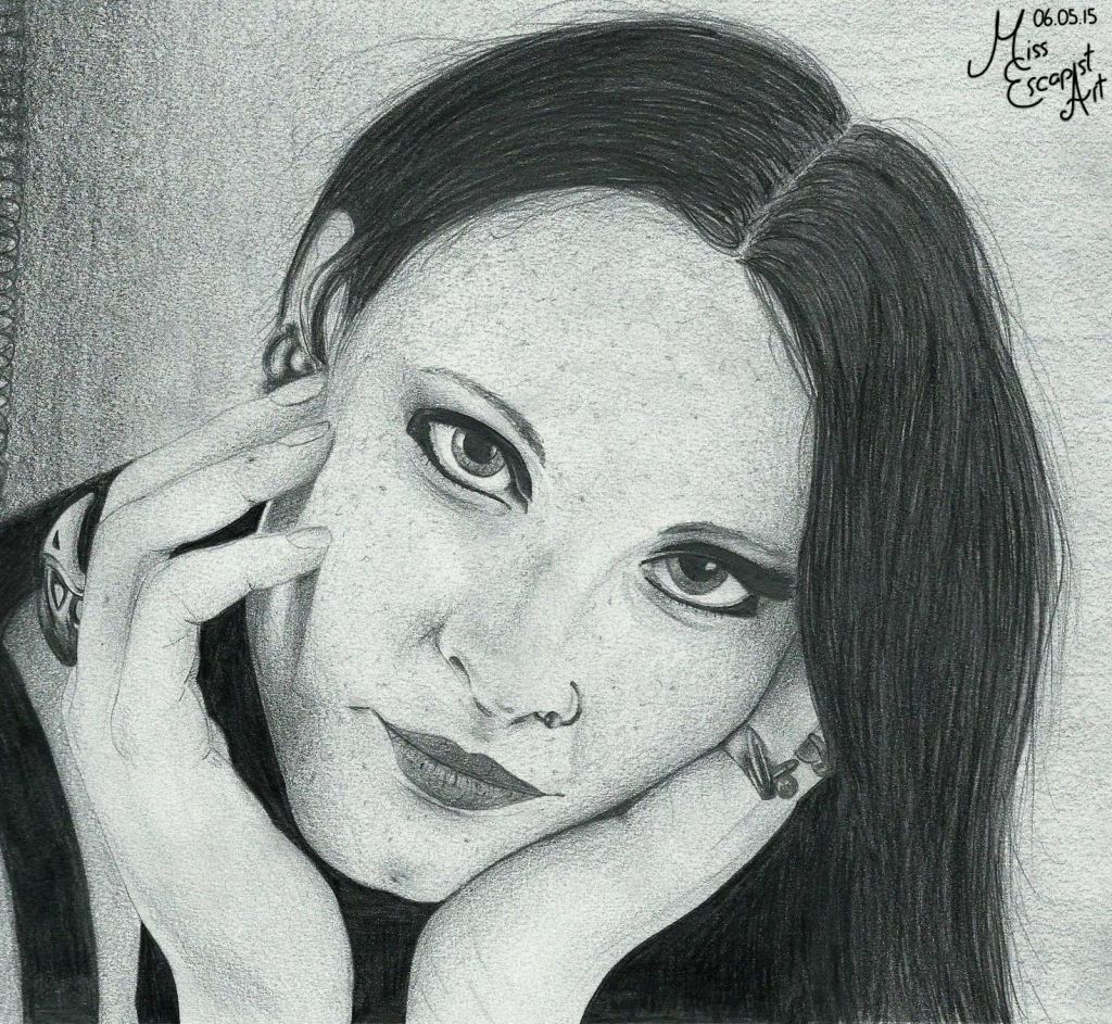
I’ve been actively drawing for about five years now. This felt like a good time to make a cut, take a step back and look at what I’ve achieved in those five years. I knew that I’ve made quite some progress when it comes to my drawing skills – I’m having way less trouble with drawing nasty details, especially hair, and  overall the results just look better than they did when I started. But I was curious on what would happen if I drew one of my old portraits with the skills that I have nowadays. So I decided to do a redraw.

Back in 2014, Tuomas and Tarja of Nightwish were the first portraits I ever drew. As I had just done a new Tuomas portrait, it was clearly Tarja’s turn now. Also, August seemed like a fiiting time to pull off this redraw-project: Tarja’s birthday is in the middle of August and also she’s close to releasing a new album (tomorrow, as a matter of fact).

No need to search for a refrence picture this time, as I’d be using exactly the same refrence as five years ago. So I jumped right into it and started by doing a rough outline sketch. After that, I began working on the face which I was able to finish quite quickly. This time, the kinda “weird” angle of her face didn’t cause me as much trouble as it did the first time. Drawing the hair, though, was probably the biggest revelation for me – until that point I hadn’t realised HOW MUCH I had actually improved. Not only did the result look so much better and way more realistic, it also took me a rather small amount of time. I haven’t stopped the time but I think it didn’t take me much longer than 3 hours to draw all of Tarja’s hair (and it’s a loooot of hair…honestly, half of the picture consists of hair only). The rest of the portrait was done in literally no time – the shirt’s just plain black and therefore pretty uncomplicated to draw and the necklace wasn’t too much work either. Last but not least I corrected a few shadings and there I was.

Phew. What a massive difference. Directly comparing the 2014 and the 2019 drawing to each other makes me quite cheerful and, well…proud. It’s amazing how much I was able to improve just by practising and gaining more experience. No one taught me this, I achieved it all myself and I think it’s a great deal. If you’re at the beginning of being an artist yourself: don’t stop to believe in yourself and keep on drawing. You will get better with each and every artwork, although it might be hard at some points. But it’s worth it and if you look back to what was five years ago (or one year, or ten, it doesn’t matter) you can see what you’ve managed to achieve already. I highly recommend taking a look back from time to time, it might give you some fresh motivation for the way that still lies ahead of you. Because we all never stop learning. I’m curious what the next five years will bring for myself and how much I will learn. Let’s face it, I’m ready.

Paper size: A4

Materials: Faber Castell blacklead pencils (4B, 5B, 6B)

Time: approx. 7 hours

Reference photo used for the drawing: ©Universal

2019, Portraits

The Tuomas Holopainen Project

Now that I‘ve finally finished the Tuomas Holopainen card design, I can write a blog-post about the process of creating both – the Tuomas drawing itself and the card. I could have written something about the drawing before but as the two belong together, it just made sense for me to wait with this a little longer.

It all started with the idea of creating a new metal king card – for Tuomas. As I haven’t had any proper drawing to use for it, I decided it would be best to do a completely new drawing. I had found my reference photo quite quickly and my first intention was to start drawing with a ballpoint pen (as that had worked out for the cards quite well in the past). I started drawing Tuomas but stopped doing so somewhere in the middle of the process as it just didn’t look right in my eyes. So, I started all over again, this time with pencils. Suddenly, the drawing process got much smoother and I was way more satisfied with what I was creating there.

After having finished drawing Tuomas (which was pretty easy going after I had made the decision to use pencils instead of a ballpoint pen), I first intended to immediately start with designing the card. But as I liked the finished portrait so much, I wanted to “complete” it with a proper background. Instead of doing a realistic background drawn with pencils, I had the idea of adding something dreamier. I got out my acrylic colours and a separate sheet of paper and painted it in a bluish tone. I added sprinkles of white colour to give it a galaxy sort of look. Then, I used a gel pen to write the titles of some Nightwish songs on top of it all. Last but not least I cut out the Tuomas drawing and glued it onto the newly created “Nightwish galaxy” and done was the Tuomas Holopainen portrait.

I was pretty satisfied with the finished portrait and therefore didn’t really dare touching it again to create the card. Also, I was lacking inspiration and so it took me quite some time to get back to it. I started doing the design two or three times but stopped again because I didn’t like the result. One day at work I finally had the sparkling idea and couldn’t wait to transform it into a card as soon as I got back home. This time, the creation process only took a few hours as I already had the idea set in my mind. First, I edited the scan of Tuomas’ portrait into the required symmetrical form and added it to a blanc card. Next, I drew the pendulum symbol and the stardust using Autodesk Sketchbook. I changed their colour quite often, finally ending up with a purple tone that seemed to fit quite well. The last thing to add on top were the music notes and after a bit of finetuning and rearranging the card was done as well.

Materials: Faber Castell blacklead pencils, acrylic colours, white gel pen, Autodesk Sketchbook, GIMP

Time: approx. 12 hours

2018, Portraits

Floor Jansen of Nightwish (The Wacken Edition)

“Deep into a dying day I took a step outside an innocent heart “

Nightwish – Wish I Had An Angel

This is one of the drawing projects that is most dear to me as it captures a moment from my very first Nightwish concert – at the legendary Wacken Open Air in summer 2018. I was there, standing in the front row (I had waited there for Nightwish to play for about 11 hours straight). I was a Nightwish fan for more than 10 years at that time, so it was kind of a BIG moment for me. I really wanted to dedicate a drawing to this special show and searched for a reference picture that I wanted to use for months. I finally ended up with drawing this scene. In my first attempt I tried doing a coloured portrait but I kinda messed things up and decided to stick with the things I knew for that drawing as I really wanted it to be perfect. Fortunately, my seccond attempt went way better and I made good progress, though I still needed a lot of patience. Especially Floor’s corset took me ages to finish as there are so many little details I had to pay attention to. Once I had finished the portrait itself the background wasn’t much of a problem anymore and I finally held the finished drawing in my hands. I’d really love to show it to Floor in person one day and I hope that I’ll get the chance to do so – sooner or later.

Paper size: A4

Materials: Faber Castell blacklead pencils

Time: approx. 20 hours

Reference photo used for the drawing was taken by: Natalia Kempin

2018, Portraits

Designing Cards

Maria Brink

In This Moment

Alissa White-Gluz

Arch Enemy

Floor Jansen

Northward & Nightwish

The idea for turning some of my drawings into card designs was actually born quite a while ago – to be more precisely, after I had drawn Maria Brink. I edited the drawing digitally to get it into a proper symmetrical form and then added a card layout to it. I never properly uploaded the picture, though. Same goes for the Alissa White-Gluz card, I created it a few months later and it also never found its way online. I just never felt like anyone would be interested in these cards as they were basically just an edit of drawings that already existed. As the end of the year was coming closer, I decided to give it a try and uploaded my first card design – and got an overwhelmingly positive response. So I felt encourage to upload the second card as well and even create a third card right away – Floor Jansen. I used the Northward drawing that I had done before for the edit. To my surprise, when I opened Instagram again after uploading that card, the first thing that I saw was my work – on Floor Jansen’s page. She seemed to have stumbled upon it and even liked it enough to repost it on her profile. Needless to say that I was rather speechless about this and felt very honoured.

Materials: GIMP, Autodesk Sketchbook

Time: approx. 5 hours

Reference photo used for the drawing were taken by: Jeremy Saffer (Maria Brink), Tim Tronckoe (Alissa White-Gluz), Northward album cover (Floor Jansen)

2018, Portraits

Floor + Alissa = Floorlissa ?

“One for all
All for one
We are strong
We are one”

Arch Enemy – Nemesis

The idea for this portrait was actually suggested to me by one of my Instagram followers and I liked it so much that I just had to draw it immediately. That idea was to merge the faces of Floor Jansen and Alissa White-Gluz in one portrait. I spent quite some time searching for good reference photos as the angles of the pictures had to be the same so that I could do a proper face merge. Luckily, I found two pictures that went together perfectly and was able to start drawing. At first, I wanted to do a regular pencil portrait but then I changed my mind and went with a ballpoint pen instead. I started off with Alissa’s half and then went over to drawing Floor. During the process I always had to cover the other half of the face because it was way too confusing to see a completely different face there. I tended to bring trademarks of Alissa’s face into Floor’s and the other way around so covering was the best that I could do. The first time that I had a closer look at the entire face merge wasn’t before the portrait was finished and I think it looks cool and confusing at the same time.

Paper size: A4

Materials: ballpoint pen

Time: approx. 8 hours

Reference photos used for the drawing were taken by: Fradellafra Fotografie (Alissa’s photo) & Steve Brown (Floor’s photo)

2018, Portraits

Marco Hietala of Nightwish

“He sets the sails one last time
Saying farewell to the world”

Nightwish – The Islander

After having drawn Nightwish ladies for so long it was just about time to finally give someone else a portrait, too. Nightwish’s very own master of bass, crazy good vocals and stupid jokes: Marco Hietala. Seriously – who doesn’t like Marco? I have always been afraid of drawing him because I know that I suck when it comes to drawing light / white hair. And he has a lot of that. I really wanted to draw him nevertheless and so I decided that I needed to get over that hesitation. I started with drawing Marco’s face as that was a more familiar thing to do before I faced my “fear” and began to work on the hair. I struggled a lot while doing so and though it ended up looking okay in the end, I still wasn’t really satisfied. Because of that it took me some time to regain my motivation for finishing the portrait. In the end, I managed to do so though and completed my work on Marco and the background.

Paper size: A4

Materials: Faber Castell blacklead pencils

Time: approx. 15 hours

Reference photo used for the drawing was taken by: Markku Hyttinen

2018, Other Artworks

Dark Chest Of Wonders

“Once I had a dream
And this is it”

Nightwish – Dark Chest of Wonders

This painting resulted from a spontaneous outburst of creativity that I had while listening to Nightwish’s “Dark Chest of Wonders”. Suddenly, I had this clear vision in front of my inner eye and I just had to paint it before losing it again. The painting itself is rather simple and so it didn’t take me too much time to finish it. Despite its simplicity, it still contains a lot of small references and hints that I’d like to write down here.

“Follow the pale moonlight” was the key phrase for making a big moon centre of the image. Turning the moon into a gigantic clock that strikes twelve results from the lyrics that say, “One night the clock struck twelve” – that’s a rather obvious one, yes. The refrain which says, “Fly to a dream” made me paint the silhouette of a flying owl (and of course it’s an owl, because it’s Nightwish). On the other hand, that passage also reminded me of Peter Pan and his flight to never-never land. So I felt like you might also see a city silhouette, that perhaps resembles London a bit, in the picture. On the rooftops, i painted the silhouette of a little child, starring up into the night sky, maybe watching the owl flying (“Once there was a child’s dream” – maybe this child is dreaming of flying away like the owl does one day.) “The window open wide” is the reason why I painted a clearly visible and enlightened window into the dark city silhouette. It might easily be the way that the little child used when it “took a step outside” to climb to the rooftop.

Interpreting the lyrics of the song is of course entirely up to you but this is the image that I get when listening the song.

Paper size: A4

Materials: acrylic colours

Time: approx. 3 hours

2016, Portraits

Tarja and Anette

“The faces of the past keep calling me to come back home, to caress the river with awe”

Nightwish – Rest Calm

When it comes to Nightwish it seems to be people’s favourite activity fight over who is / was the best singer. I usually don’t participate in such debates as I think that every singer brought something unique and valuable into the band. They’re all so very different, why should I even bother comparing them with one another instead of just enjoying their music? With this thought in my head I decided to do a portrait of both, Tarja and Anette, standing right next to each other. Because I wanted to respect both previous singers in the same way. So I searched for reference pictures, got out my pencils and then started drawing. I needed a surprisingly short amount of time to finish drawing both ladies and all that was left to do was shading the background.

Paper size: A4

Materials: Faber Castell blacklead pencils

Time: approx. 5 hours

2015, Other Artworks

Kingdom Animalia

“A midnight flight into Covington Woods, a princess and a panther by my side”

Nightwish – Song Of Myself

This drawing is yet another dedication to my Nightwish-madness, only this time it’s not a portrait. The inspiration for this one came from the songs or to be more precisely from the lyrics. There are certain animals that you’ll find in Nightwish lyrics again and again, that have a certain significance. I guess the owl is the most prominent example. But there are also animals that you perhaps haven’t noticed before, animals that are mentioned only a single time and that don’t stick in your memory. I wanted to include them all in my drawing so I went through all my Nightwish albums to see how many animals I’ll be able to find. I noted them all down and counted how many times they appeared in the lyrics or booklet artworks. Then I started drawing an outline of the wolf and the owl and tried to arrange all the other animals into the picture as well. After that was done I started colouring and outlining with Faber Castell Artist Pens and added little splatters of watercolour on top of that.

Paper size: A3

Materials: PITT Artist Pens, watercolour

Time: approx. 3 hours

2015, Portraits

Floor Jansen of Nightwish

” I do not wish to evade the world, yet I will forever build my own”

Nightwish – My Walden

Motivated by my rather successful attempt of drawing Alissa I felt ready to dedicate a portrait to the flying Dutchwoman Floor Jansen – my favourite singer and the new vocalist of my favourite band Nightwish. The time to do so felt right as Nightwish were just about to release “Endless Forms Most Beautiful” – their first studio album featuring Floor. First, I wanted to pick one of the promo shoots as a reference photo but then I ended up doing a rather simple face portrait. Especially drawing the skin went quite well and I got a really smooth result. I also invested a lot of time into drawing the hair because I didn’t want it to look as unrealistic as all of the hair mess that I had drawn for previous portraits. I messed up another thing, though, and that’s the eyeliner as it looks way too dark and harsh. But apart from that I was quite happy with the finished portrait and I felt like I’ve really made some progress since my first drawing.

Paper size: A4

Materials: Faber Castell blacklead pencils

Time: approx. 7 hours