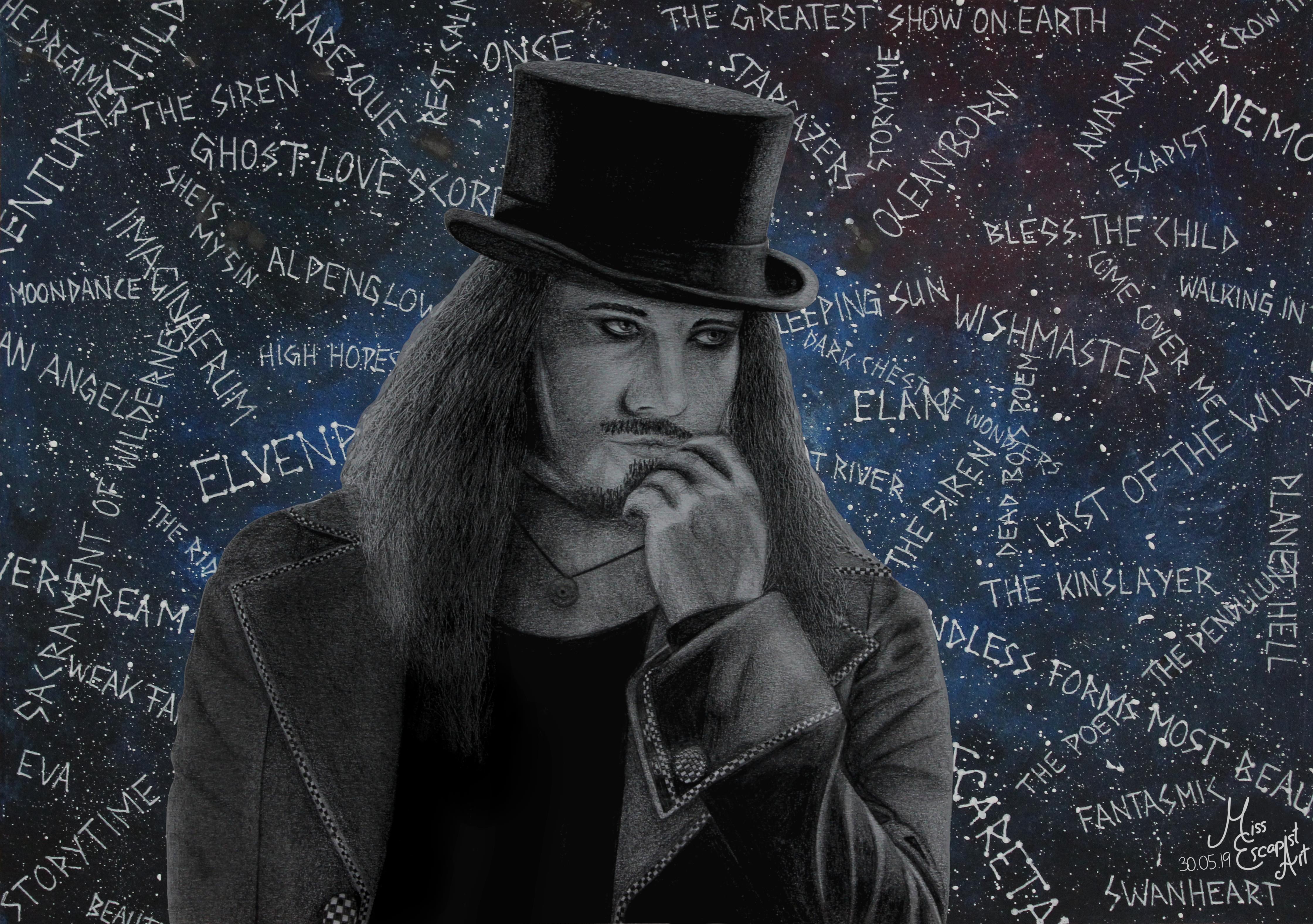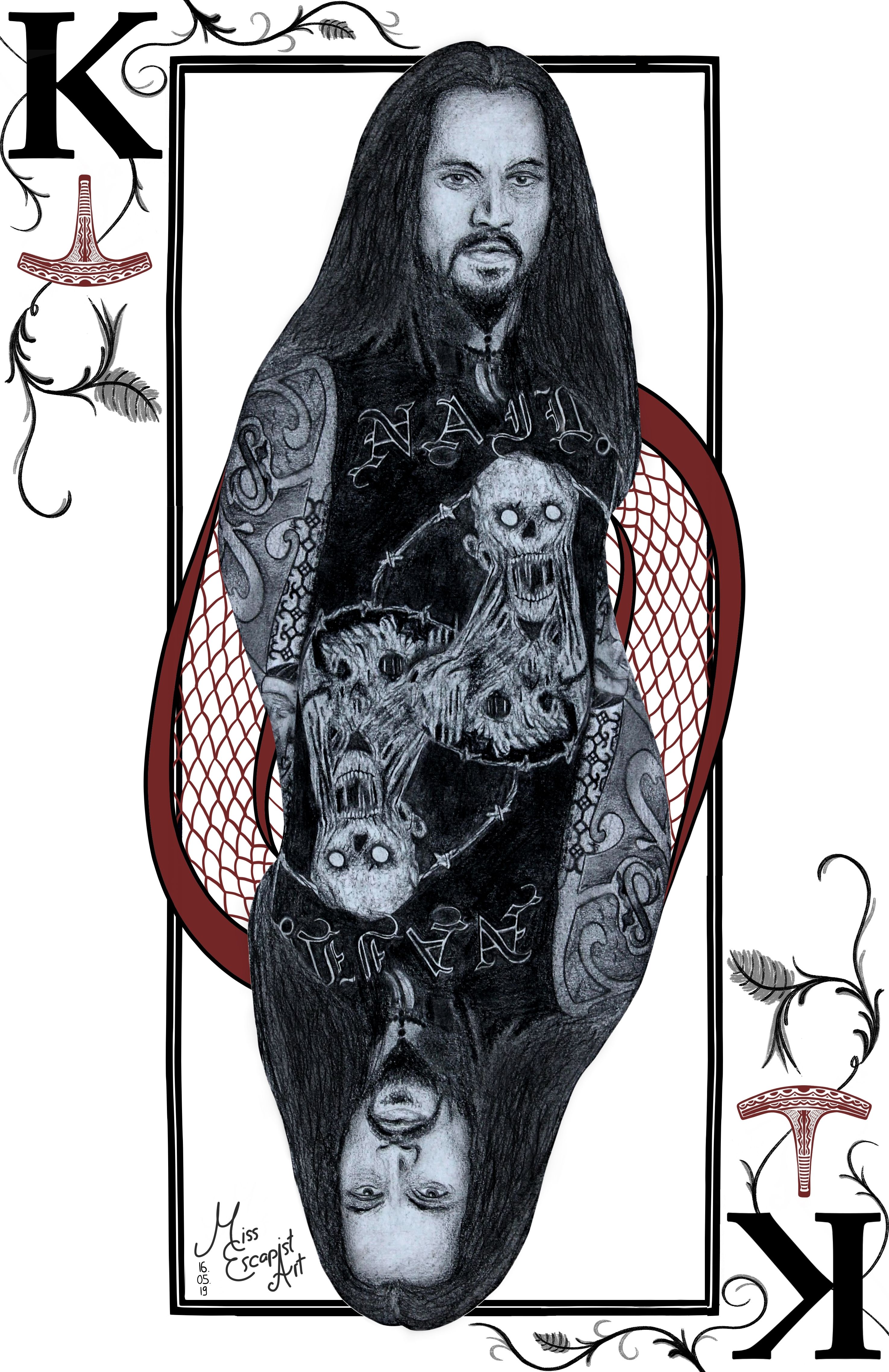

Now that I‘ve finally finished the Tuomas Holopainen card design, I can write a blog-post about the process of creating both – the Tuomas drawing itself and the card. I could have written something about the drawing before but as the two belong together, it just made sense for me to wait with this a little longer.
It all started with the idea of creating a new metal king card – for Tuomas. As I haven’t had any proper drawing to use for it, I decided it would be best to do a completely new drawing. I had found my reference photo quite quickly and my first intention was to start drawing with a ballpoint pen (as that had worked out for the cards quite well in the past). I started drawing Tuomas but stopped doing so somewhere in the middle of the process as it just didn’t look right in my eyes. So, I started all over again, this time with pencils. Suddenly, the drawing process got much smoother and I was way more satisfied with what I was creating there.
After having finished drawing Tuomas (which was pretty easy going after I had made the decision to use pencils instead of a ballpoint pen), I first intended to immediately start with designing the card. But as I liked the finished portrait so much, I wanted to “complete” it with a proper background. Instead of doing a realistic background drawn with pencils, I had the idea of adding something dreamier. I got out my acrylic colours and a separate sheet of paper and painted it in a bluish tone. I added sprinkles of white colour to give it a galaxy sort of look. Then, I used a gel pen to write the titles of some Nightwish songs on top of it all. Last but not least I cut out the Tuomas drawing and glued it onto the newly created “Nightwish galaxy” and done was the Tuomas Holopainen portrait.
I was pretty satisfied with the finished portrait and therefore didn’t really dare touching it again to create the card. Also, I was lacking inspiration and so it took me quite some time to get back to it. I started doing the design two or three times but stopped again because I didn’t like the result. One day at work I finally had the sparkling idea and couldn’t wait to transform it into a card as soon as I got back home. This time, the creation process only took a few hours as I already had the idea set in my mind. First, I edited the scan of Tuomas’ portrait into the required symmetrical form and added it to a blanc card. Next, I drew the pendulum symbol and the stardust using Autodesk Sketchbook. I changed their colour quite often, finally ending up with a purple tone that seemed to fit quite well. The last thing to add on top were the music notes and after a bit of finetuning and rearranging the card was done as well.
Materials: Faber Castell blacklead pencils, acrylic colours, white gel pen, Autodesk Sketchbook, GIMP
Time: approx. 12 hours
