2019

Inktober 2019

Once again, I decided to give Inktober a try. I didn’t really know how to do it, though, as October was quite packed with moving around and traveling a lot. So I certainly wouldn’t be able to do it the traditional way. Instead, I decided to train my digital drawing skills a bit and draw in Autodesk Sketchbook on my tablet. Which didn’t turn out quite as easy as I had hoped – still very unfamiliar with drawing digitally it took me ages to finish the artworks and therefore I wasn’t able to create a drawing for every prompt. In addition to that, I got sick in the middle of October and had to take a break from drawing.

But I definitely learned and improved and that’s the most important part of Inktober, right?

01.10.2019

“ring”

02.10.2019

“mindless”

03.10.2019

“bait”

04.10.2019

“freeze”

05.10.2019

“build”

06.10.2019

“husky”

07.10.2019

“enchanted”

08.10.2019

“frail”

09.10.2019

“swing”

10.10.2019

“pattern”

11.10.2019

“snow”

12.10.2019

“dragon”

13.10.2019

“ash”

17.10.2019

“ornament”

30.10.2019

“catch”

Materials: Autodesk Sketchbook

Time: approx. 2-3 hours per drawing

2019, Portraits

The Tuomas Holopainen Project

Now that I‘ve finally finished the Tuomas Holopainen card design, I can write a blog-post about the process of creating both – the Tuomas drawing itself and the card. I could have written something about the drawing before but as the two belong together, it just made sense for me to wait with this a little longer.

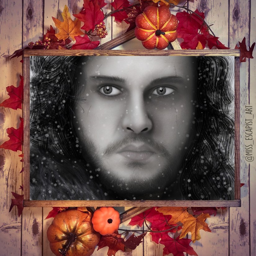
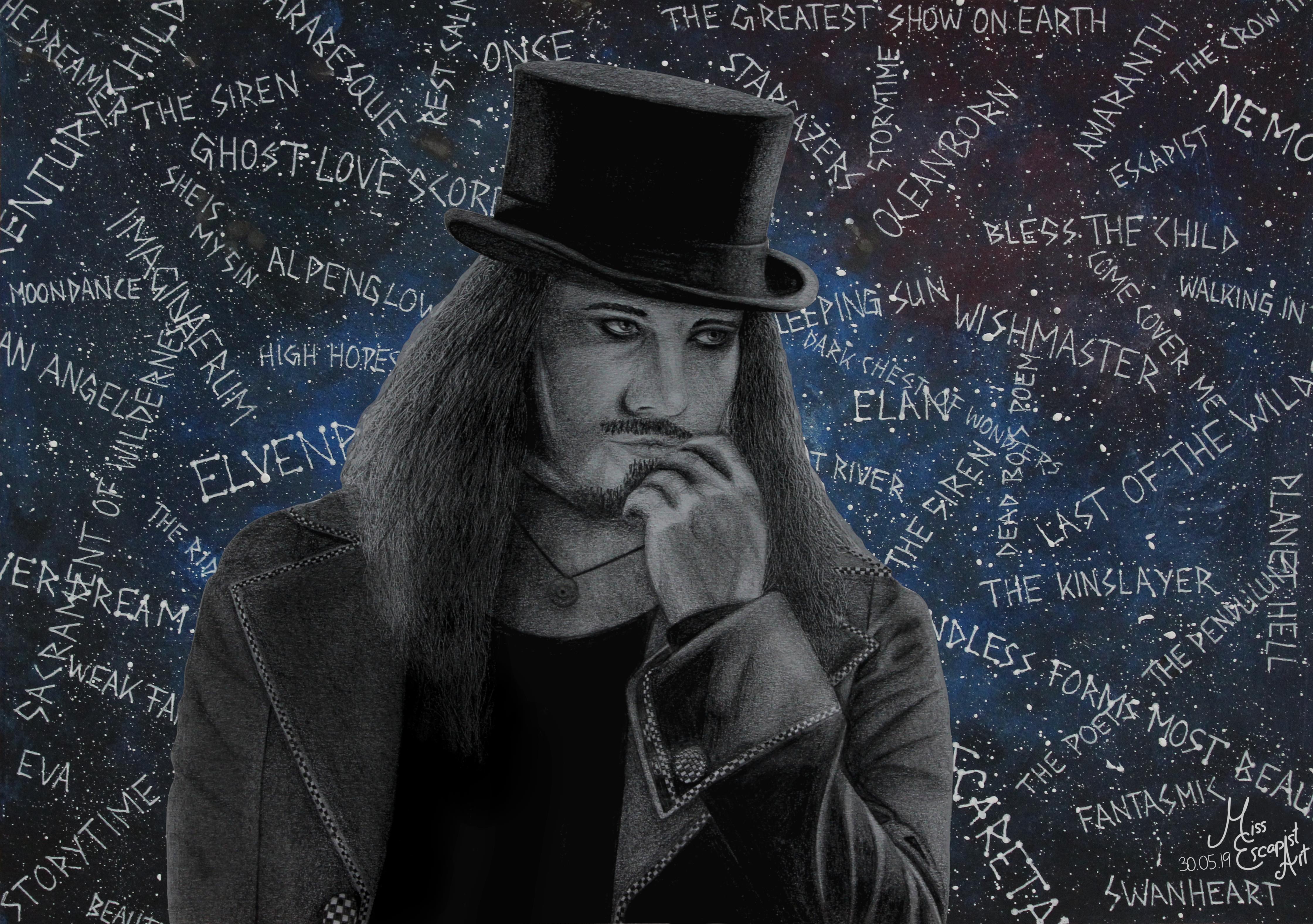
It all started with the idea of creating a new metal king card – for Tuomas. As I haven’t had any proper drawing to use for it, I decided it would be best to do a completely new drawing. I had found my reference photo quite quickly and my first intention was to start drawing with a ballpoint pen (as that had worked out for the cards quite well in the past). I started drawing Tuomas but stopped doing so somewhere in the middle of the process as it just didn’t look right in my eyes. So, I started all over again, this time with pencils. Suddenly, the drawing process got much smoother and I was way more satisfied with what I was creating there.

After having finished drawing Tuomas (which was pretty easy going after I had made the decision to use pencils instead of a ballpoint pen), I first intended to immediately start with designing the card. But as I liked the finished portrait so much, I wanted to “complete” it with a proper background. Instead of doing a realistic background drawn with pencils, I had the idea of adding something dreamier. I got out my acrylic colours and a separate sheet of paper and painted it in a bluish tone. I added sprinkles of white colour to give it a galaxy sort of look. Then, I used a gel pen to write the titles of some Nightwish songs on top of it all. Last but not least I cut out the Tuomas drawing and glued it onto the newly created “Nightwish galaxy” and done was the Tuomas Holopainen portrait.

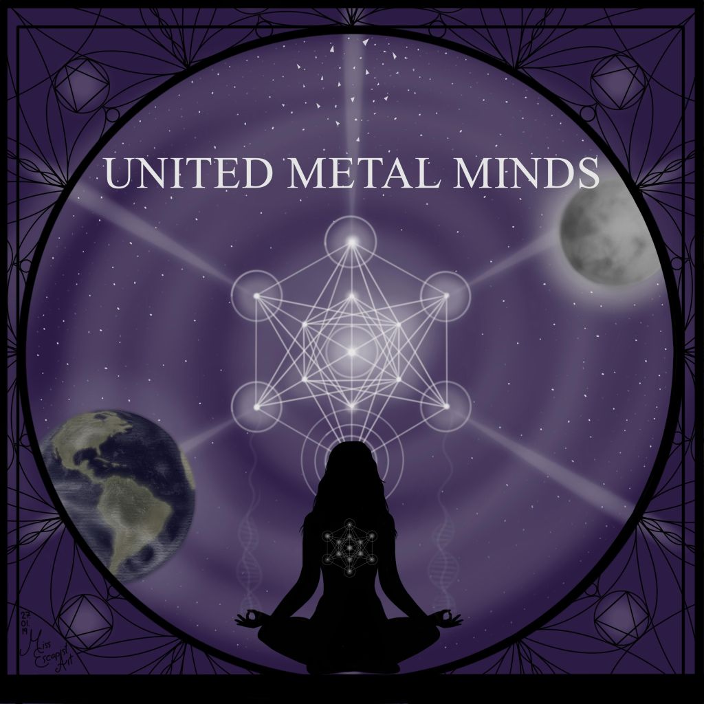
I was pretty satisfied with the finished portrait and therefore didn’t really dare touching it again to create the card. Also, I was lacking inspiration and so it took me quite some time to get back to it. I started doing the design two or three times but stopped again because I didn’t like the result. One day at work I finally had the sparkling idea and couldn’t wait to transform it into a card as soon as I got back home. This time, the creation process only took a few hours as I already had the idea set in my mind. First, I edited the scan of Tuomas’ portrait into the required symmetrical form and added it to a blanc card. Next, I drew the pendulum symbol and the stardust using Autodesk Sketchbook. I changed their colour quite often, finally ending up with a purple tone that seemed to fit quite well. The last thing to add on top were the music notes and after a bit of finetuning and rearranging the card was done as well.

Materials: Faber Castell blacklead pencils, acrylic colours, white gel pen, Autodesk Sketchbook, GIMP

Time: approx. 12 hours

2019, Other Artworks

United Metal Minds

“Open your mind
Then you will be
Balanced and free”

Epica – Beyond The Matrix

Shortly after Simone’s birthday portrait I decided to give digital drawing another chance – and created an illustration for Mark Jansen’s “United Metal Minds” project.  When I started drawing, I didn’t have any concept for how I wanted the picture to look like. I started off by colouring the background and drawing the United Metal Minds logo in the centre. After that I continued with adding the silhouette of a woman meditating, then I drew the moon and earth in opposite corners of the picture. Last but not least, I added a sort of “mandala” frame to the image.

At first, it was rather difficult for me to come up with ideas for the illustration as I didn’t have any music to refer to and only a rather vague topic but I tried to make the best out of it.

A few explanations on the artwork itself: the logo in the center isn’t my own design, it depicts a symbol called “Metatron’s Cube” – a reference for energy, motivation and focus. The silhouette of the meditating woman is supposed to be a symbol for the mind and the ability to focus on it.
The cube symbol resembles the “Flower of Life” symbol. If you look closely at the woman’s hands you can see a DNA strand just above – as a symbol for life and its origin. I was trying to connect two things with the used symbolism – spirituality (=meditation) and science (=DNA strand) – as I think both can strongly define your view on the world. The moon and earth symbolise connection, interaction and also life. The frame, once again, is a mandala to adapt to Metraton’s Cube in the centre of the illustration.

Materials: Autodesk Sketchbook

Time: approx. 8 hours

2019, Portraits

Simone Simons Card Design

“Only you is what you’ll be
All you are is what you see”

Epica – The Holographic Principle

Every now and then I pick up someone’s birthday as an opportunity to start a new portrait – and in this case, it’s Simone Simons again. I immediately thought of the metal queen card designs that I had done before as Simone definitely deserves a spot in the list of my favourite metal ladies. As I had just bought myself a new convertible, this also gave me the perfect excuse for trying out Autodesk Sketchbook on it. I had never drawn digitally before, so it was bound to become a challenge right from the start. Doing the first sketch wasn’t so very complicated but getting the shadings right was. It took me quite some time to get used to the new drawing dynamic and although the convertible also reacts to applied pressure changes it’s not quite the same than it would’ve been with a pencil. All of the lines that I drew were either too soft or too harsh in the beginning. I slowly started getting used to it, though, and the final result didn’t look as bad as I had feared. I took the finished portrait and edited it to match the blanco card design, then I added a few extra details and the Epica logo before I was finally done

Materials: Autodesk Sketchbook

Time: approx. 8 hours

Reference photo used for the drawing was taken by: Tim Tronckoe