2019, Portraits

Sabaton – 20 Years

Where is this greatness I’ve been told? This is the lies that we been sold.”

Sabaton – Great War

This project is one of the bigger ones that I did this year so far. I’ve had some plans concerning a Sabaton drawing for quite some time and with the release of their new album „The Great War“ and their special anniversary show at Wacken coming up, I felt like it was finally time to start drawing. I wanted the artwork to be connected to both – Sabaton and Wacken – as I had my ticket for Wacken and was definitely planning to see their show. First, I wanted the band portrait to be based on live photos of the band playing but as I couldn’t find suitable references I decided to go with “standard promo pictures” instead. The ones that I found on Sabaton’s website were exactly what I had been looking for and so I started to arrange the photos of the single band members until I had a nice group constellation. The next part was a lengthy but relatively easy-going procedure: pencil portrait time! For the background, I used acrylic colours and painted another sheet of paper with them. To bring together portrait and background, I cut out the guys and carefully glued them onto the background which was the most stressful part of this artwork – at least emotionally – as I was terribly afraid of ruining the portrait by making a mistake while cutting. It all came to a good end, though, and you can barely see the cuts at all. For Wacken, I got my drawing printed on a large flag. I took the flag with me and we hissed it in our camp for the entire seven days of the festival.

I recorded almost the entire drawing process and made time-lapse videos that I uploaded to my YouTube channel, so if you’re interested in seeing how I worked feel free to head over there (the channel is called “Miss Escapist Art”, not much of a surprise, I know…).

Paper size: A3

Materials: Faber Castell blacklead pencils, acrylic colors

Time: approx. 20 hours

Reference photos used for the drawing: taken from Sabaton’s official website
2019, Portraits

The Tuomas Holopainen Project

Now that I‘ve finally finished the Tuomas Holopainen card design, I can write a blog-post about the process of creating both – the Tuomas drawing itself and the card. I could have written something about the drawing before but as the two belong together, it just made sense for me to wait with this a little longer.

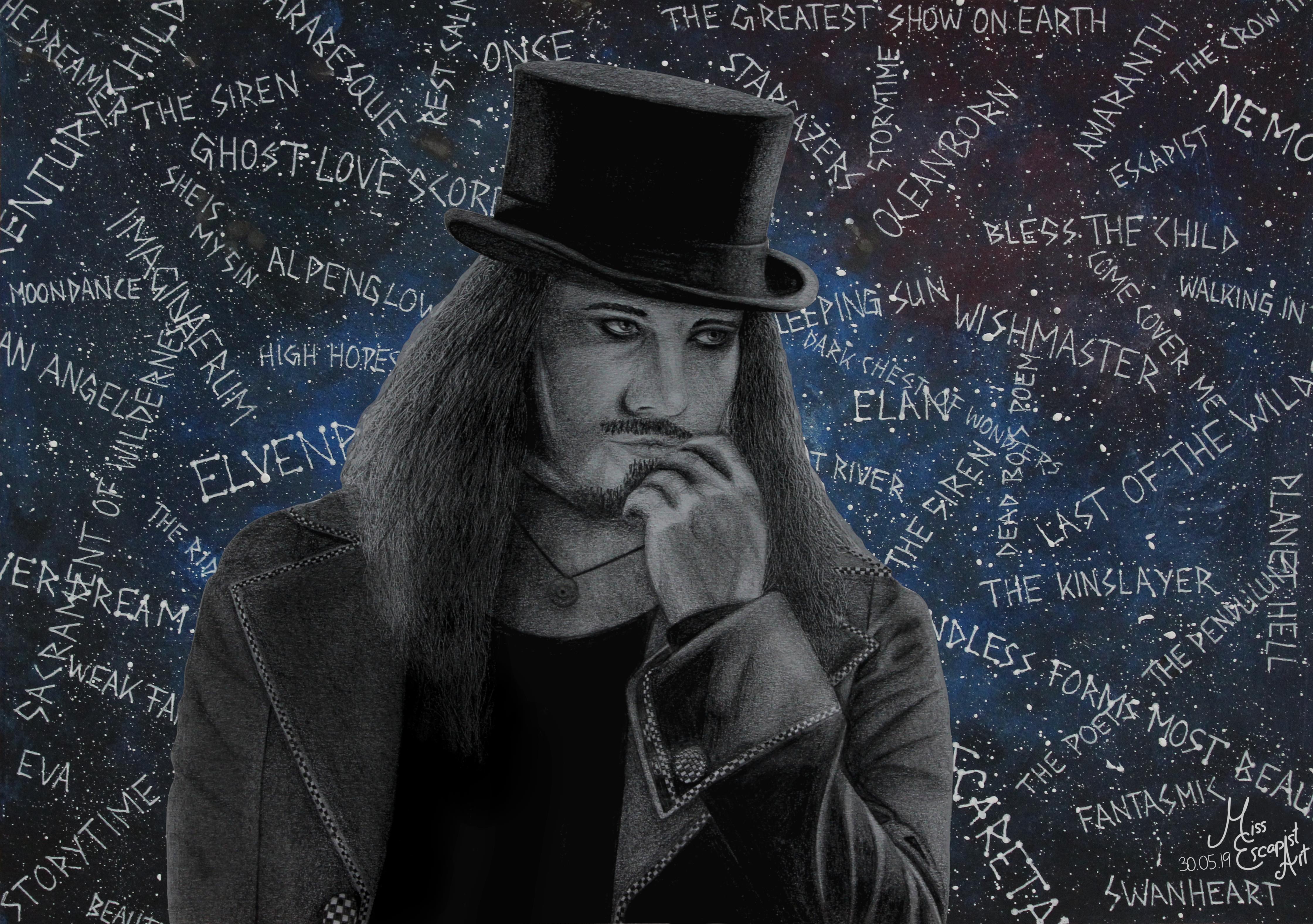
It all started with the idea of creating a new metal king card – for Tuomas. As I haven’t had any proper drawing to use for it, I decided it would be best to do a completely new drawing. I had found my reference photo quite quickly and my first intention was to start drawing with a ballpoint pen (as that had worked out for the cards quite well in the past). I started drawing Tuomas but stopped doing so somewhere in the middle of the process as it just didn’t look right in my eyes. So, I started all over again, this time with pencils. Suddenly, the drawing process got much smoother and I was way more satisfied with what I was creating there.

After having finished drawing Tuomas (which was pretty easy going after I had made the decision to use pencils instead of a ballpoint pen), I first intended to immediately start with designing the card. But as I liked the finished portrait so much, I wanted to “complete” it with a proper background. Instead of doing a realistic background drawn with pencils, I had the idea of adding something dreamier. I got out my acrylic colours and a separate sheet of paper and painted it in a bluish tone. I added sprinkles of white colour to give it a galaxy sort of look. Then, I used a gel pen to write the titles of some Nightwish songs on top of it all. Last but not least I cut out the Tuomas drawing and glued it onto the newly created “Nightwish galaxy” and done was the Tuomas Holopainen portrait.

I was pretty satisfied with the finished portrait and therefore didn’t really dare touching it again to create the card. Also, I was lacking inspiration and so it took me quite some time to get back to it. I started doing the design two or three times but stopped again because I didn’t like the result. One day at work I finally had the sparkling idea and couldn’t wait to transform it into a card as soon as I got back home. This time, the creation process only took a few hours as I already had the idea set in my mind. First, I edited the scan of Tuomas’ portrait into the required symmetrical form and added it to a blanc card. Next, I drew the pendulum symbol and the stardust using Autodesk Sketchbook. I changed their colour quite often, finally ending up with a purple tone that seemed to fit quite well. The last thing to add on top were the music notes and after a bit of finetuning and rearranging the card was done as well.

Materials: Faber Castell blacklead pencils, acrylic colours, white gel pen, Autodesk Sketchbook, GIMP

Time: approx. 12 hours

2018, Other Artworks

The Shadow Theory

“I am all you ever wanted
I’m a new dimension”

Kamelot – Phantom Divine

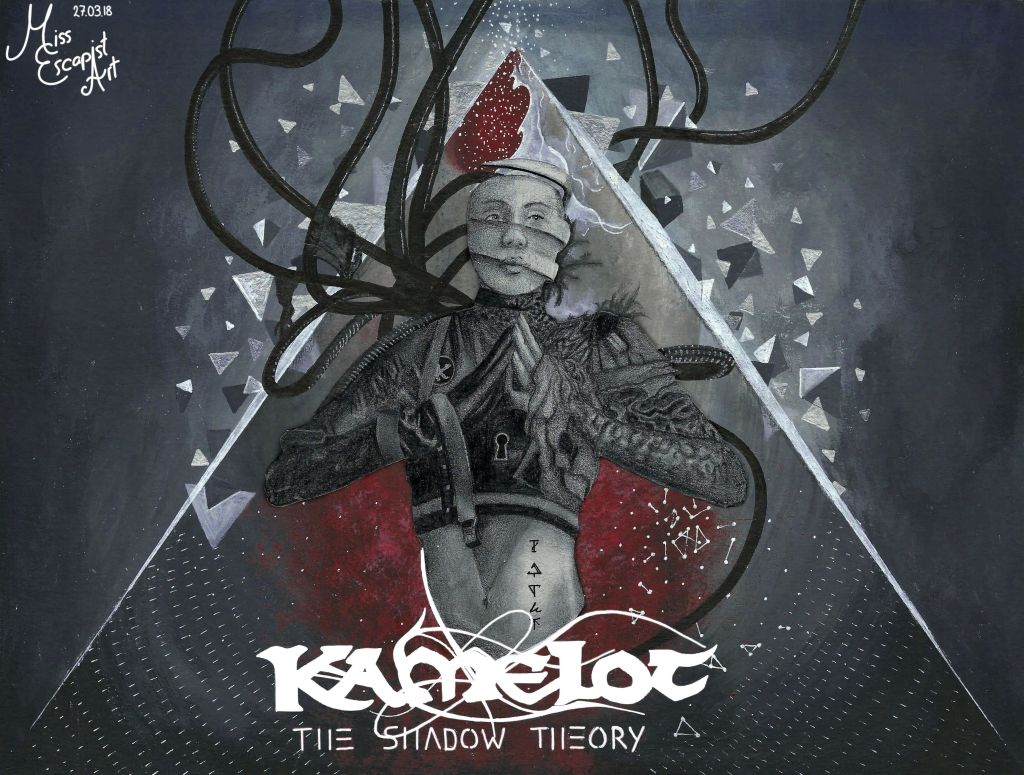
A few weeks before releasing “The Shadow Theory” Kamelot announced an artwork contest: The person who did the best artwork based on their new album cover would get the chance to meet with the band before one of their shows on their upcoming world tour. Of course, Kamelot didn’t need to tell me that twice and I immediately decided I was in for the challenge. I did not feel like changing lot in the album artwork itself as it was already amazing – instead I just wanted to bring my own artistical style to it. First, I did the basic shading for the background with acrylic colours, then I continued with adding the details to it. I thought it might be a nice contrast to the rest of the painting, to draw the woman in the centre with blacklead pencils instead of using acrylic colours, too. So I started drawing her with my pencils but I soon came to realise that the paper wasn’t really suitable for pencil works. She just didn’t look good at all but I didn’t want to throw the rest of the drawing away and so I came up with an alternative. I got out the paper that I usually use for pencil drawings and started drawing again. After I was done with that, I cut out the figure and glued it on top of my earlier attempt and – voila – done was my entry for the contest. End of the story is that I never heard anything from that contest again – either I didn’t win and they only informed the winner(s) privately. Or they completely forgot about the contest. I don’t know but I like my artwork anyway.

Paper size: A4

Materials: acrylic colours, Faber Castell blacklead pencils

Time: approx. 8 hours

Reference photo used for the drawing: album cover for “The Shadow Theory”

2018, Other Artworks

Dark Chest Of Wonders

“Once I had a dream
And this is it”

Nightwish – Dark Chest of Wonders

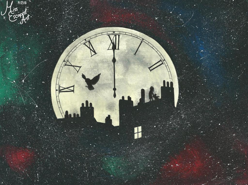
This painting resulted from a spontaneous outburst of creativity that I had while listening to Nightwish’s “Dark Chest of Wonders”. Suddenly, I had this clear vision in front of my inner eye and I just had to paint it before losing it again. The painting itself is rather simple and so it didn’t take me too much time to finish it. Despite its simplicity, it still contains a lot of small references and hints that I’d like to write down here.

“Follow the pale moonlight” was the key phrase for making a big moon centre of the image. Turning the moon into a gigantic clock that strikes twelve results from the lyrics that say, “One night the clock struck twelve” – that’s a rather obvious one, yes. The refrain which says, “Fly to a dream” made me paint the silhouette of a flying owl (and of course it’s an owl, because it’s Nightwish). On the other hand, that passage also reminded me of Peter Pan and his flight to never-never land. So I felt like you might also see a city silhouette, that perhaps resembles London a bit, in the picture. On the rooftops, i painted the silhouette of a little child, starring up into the night sky, maybe watching the owl flying (“Once there was a child’s dream” – maybe this child is dreaming of flying away like the owl does one day.) “The window open wide” is the reason why I painted a clearly visible and enlightened window into the dark city silhouette. It might easily be the way that the little child used when it “took a step outside” to climb to the rooftop.

Interpreting the lyrics of the song is of course entirely up to you but this is the image that I get when listening the song.

Paper size: A4

Materials: acrylic colours

Time: approx. 3 hours

2017, Other Artworks

Winter Is Coming

“Winter is coming.”

Everyone in Game of Thrones

Always

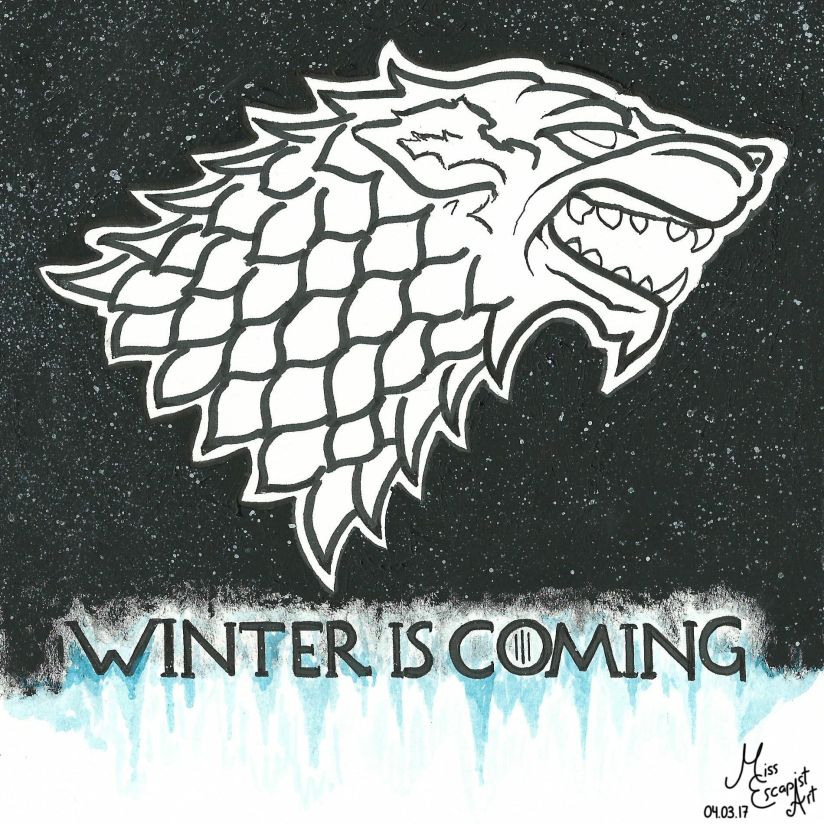
With the seventh season of Game of Thrones coming up it just seemed natural to dedicate an artwork to what’s probably my favourite series. As I couldn’t decide for a character and didn’t have that much time anyways, I went with the logo of house Stark instead. At first, I didn’t intend to draw anything more than the wolf. But once I was done with that, the picture seemed quite boring to me and so I added some black background, the “Winter Is Coming” plus a bit of ice and snowflakes. Much better now.

Paper size: A4

Materials: acrylic colours, PITT Artist Pens

Time: approx. 1 hour

2017, Other Artworks

It’s Epica – Again

“We challenge illusions
Created by us all”

Epica – The Holographic Principle

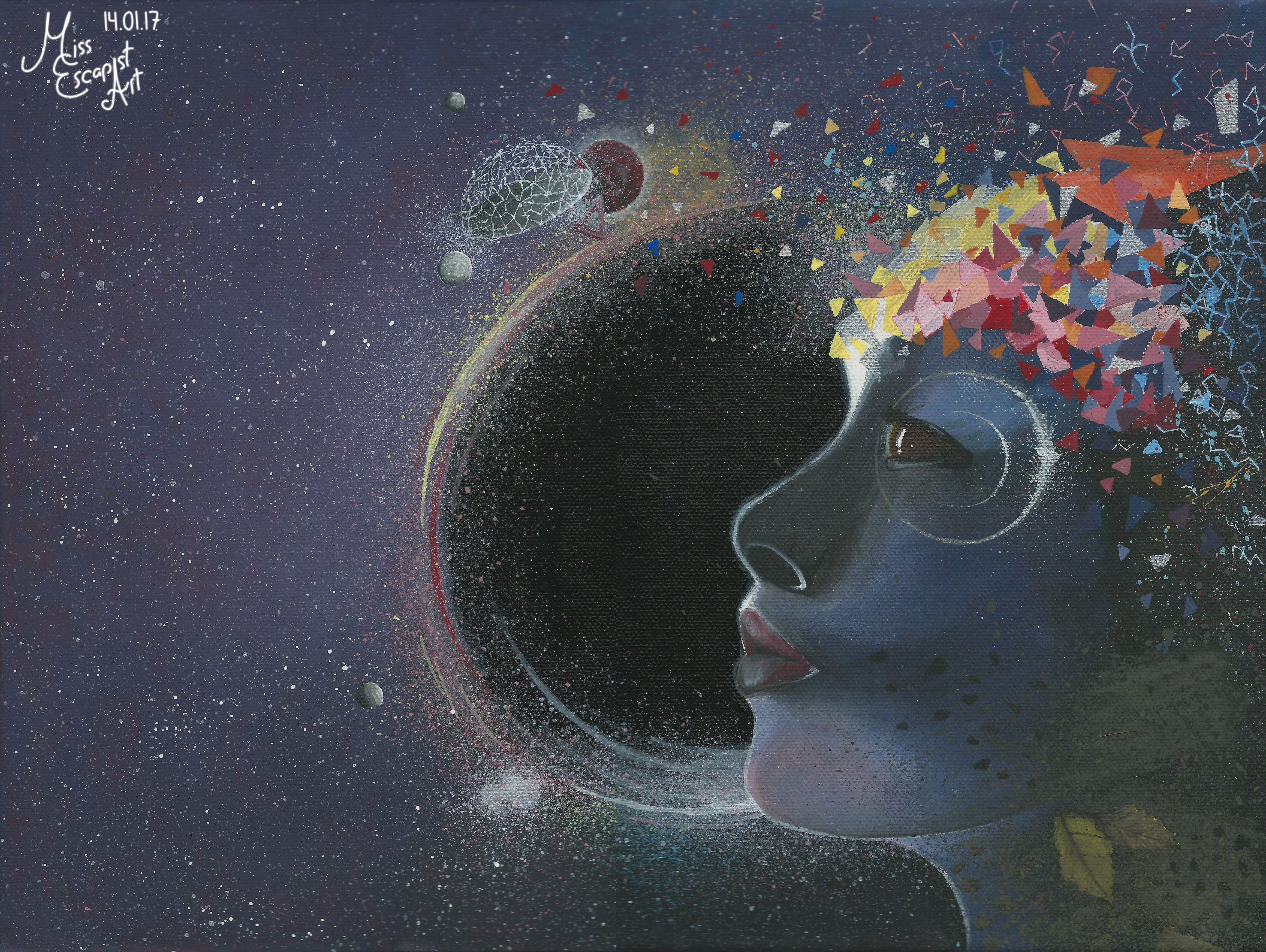
A few days after finishing Simone Simons portrait I bought myself a VIP ticket for one of Epica’s shows that I already had a ticket for. There was only one month left until the show and the Meet & Greet that I had access to through the VIP ticket. I knew that I’d definitely take the portrait of Simone with me to show it to her and to get it signed. As there was still time, why not do another fanart, that wasn’t focussed on a single band member but rather on their latest album “The Holographic Principle”. As I liked the album cover a lot and it wasn’t too complicated, I decided to paint it on my last canvas. After making the usual rough sketch I started with a purple base layer and then added some highlights and shadows. After that I worked out the face. This time painting the black areas black was the last thing I did (Yes, I’ve learned a thing or two from my Delain painting.). For adding all the colourful geometric details I used a very fine brush and carefully painted them on top. Last step: a lot of stars and a few silver highlights.

I managed to finish the painting two weeks before the concert and was all ready to go and get it signed.

Paper size: 30 x 45 canvas

Materials: acrylic colours

Time: approx. 7 hours

Reference picture used for the painting: cover of the album “The Holographic Principle”

2016, Other Artworks

Moonbathers

“We’ll let it storm and rain
We’ll be the hurricane”

Delain – The Hurricane

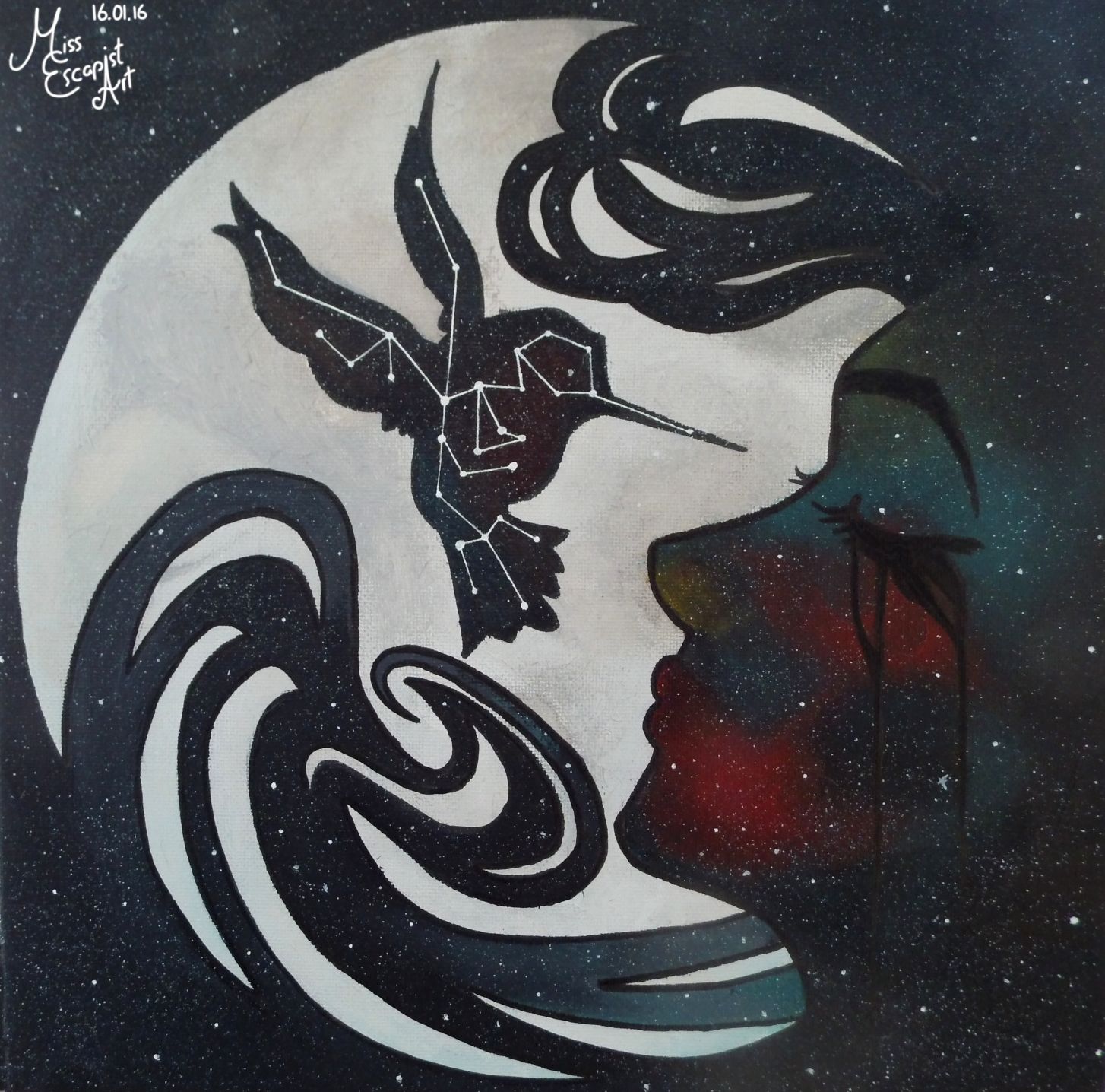
There are few bands whose album artworks are as appealing to me as Delain. They always manage to capture me with the beautiful illustrations in their booklets as they are super atmospheric. Furthermore, they’ll most likely include a moon and/or a hummingbird and/or my favourite colours. So I was bound to fall in love with this one, of course. And I just had to paint the motive, there was no way around it. Luckily, I still had a canvas lying around so I was able to start right away. I started by drawing a big circle right in the middle and then went on with painting the moon. When the moon was done, I sketched the face and hummingbird silhouettes on top and filled them and the background with a basic layer of black. Now I had to paint some areas red / green which wasn’t as easy as I had imagined it to be. The black background just seemed to absorb every bit of colour that I put onto it. After 8 layers of paint the colours were finally visible and I could continue with making it look like a starry night sky. Therefore, I added fine sprinkles of white paint to the painting. For the stellar hummingbird constellation, I used a fine white gel pen to be able to draw all the lines steadily. I think the result comes quite close to the original, though it of course will never look as perfect. This is one of the artworks that I’d really like to get signed one day, let’s see if I’ll be lucky enough to show it to Delain one day

Paper size: 30 x 30 canvas

Materials: acrylic colours

Time: approx. 6 hours

Reference picture used for the painting: an illustration from the album “Moonbathers”

2015, Other Artworks

Lilacs

“My wings are my eyes
I’m seeing the blue skies
I’ll fly, I’ll fly away”

Amberian Dawn – Wings Are My Eyes

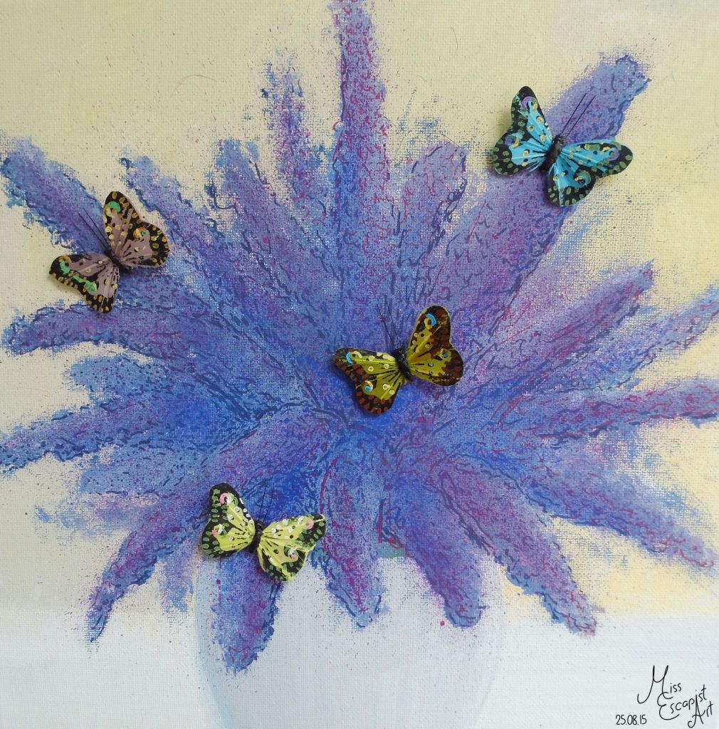
Time for another flowery piece of art – a bunch of lilacs. The painting was supposed to be a birthday present for my grandma who loves these flowers. So I got out a canvas and acrylic paint and started doing a base layer of colour for the background. I put a pencil sketch on top of that and then started painting the actual flowers. To get details into the blossoms I used my purple artist pens. When I was finally satisfied with the picture itself I started arranging little decorative butterflies that I had lying around and glued them to the painting. They give a nice little three-dimensional touch to the artwork that you can’t really see on this photo. My grandma was very happy about the painting and she’s still got it hanging on her wall.

Paper size: 30 x 30 canvas

Materials: acrylic colours, PITT Artist Pens, little butterfly figures

Time: approx. 2 hours