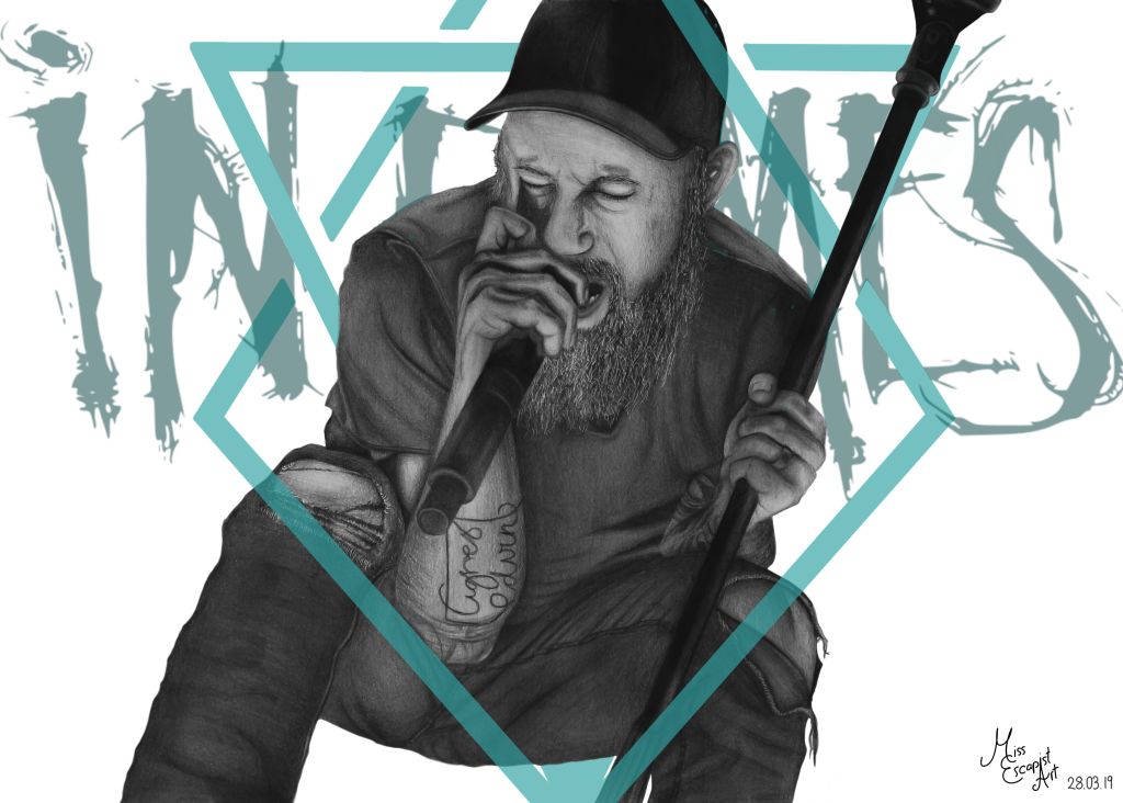
“Three nights of Hell Immortality spell Light up the skies Make it through the darkness”
Lacuna Coil – Blood, Tears, Dust
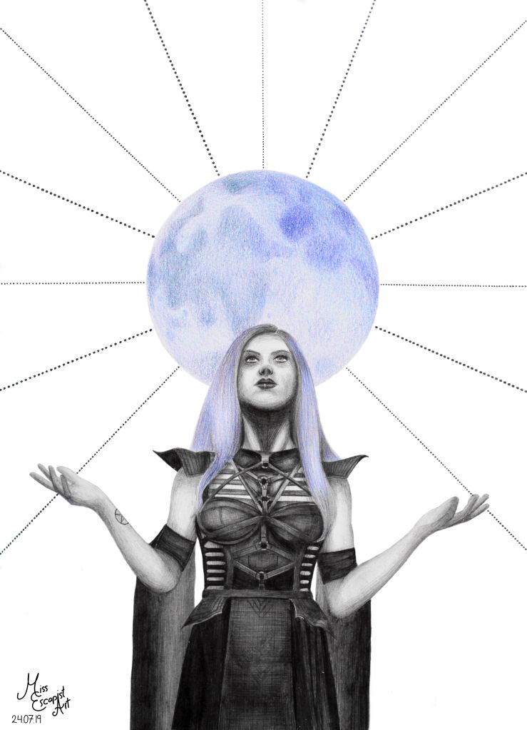
After the massive (and quite unexpected) success of my moonlight-Alissa-ballpoint drawing I felt encouraged enough to give it a second try and draw another metal lady in a similar style. I started a voting on Instagram, asking my followers whether I should draw Charlotte Wessels of Delain or Cristina Scabbia of Lacuna Coil. As the majority voted for Cristina…I drew Cristina (sorry Charlotte, I’ll draw you another time, I promise).
Searching for a reference picture turned out more difficult than I had expected – not because of a lack of suitable references but because there were too many. Eventually, I managed to decide and ended up choosing one of the “simpler” photos. The general layout of the drawing would be identical with the layout that I came up with for Alissa’s portrait so I basically just had to “copy” everything. Apart from the fact that I gave the moon another colour and of course drew Cristina instead of Alissa. I decided to make the moon red this time because the colour seemed most appropriate to me, matching Cristina’s red scar (and also because Lacuna Coil like to use red in their imagery in general). Drawing Cristina herself wasn’t that much of an effort as her outfit is relatively simple and didn’t require too much attention to tiny details.
“Promises mean everything Life won’t look back for you”
Tarja – Dead Promises
I’ve been actively
drawing for about five years now. This felt like a good time to make a cut,
take a step back and look at what I’ve achieved in those five years. I knew
that I’ve made quite some progress when it comes to my drawing skills – I’m
having way less trouble with drawing nasty details, especially hair, and overall the results just look better than
they did when I started. But I was curious on what would happen if I drew one
of my old portraits with the skills that I have nowadays. So I decided to do a
redraw.
Back in 2014, Tuomas
and Tarja of Nightwish were the first portraits I ever drew. As I had just done
a new Tuomas portrait, it was clearly Tarja’s turn now. Also, August seemed
like a fiiting time to pull off this redraw-project: Tarja’s birthday is in the
middle of August and also she’s close to releasing a new album (tomorrow, as a
matter of fact).
No need to search for a refrence picture this time, as I’d be using exactly the same refrence as five years ago. So I jumped right into it and started by doing a rough outline sketch. After that, I began working on the face which I was able to finish quite quickly. This time, the kinda “weird” angle of her face didn’t cause me as much trouble as it did the first time. Drawing the hair, though, was probably the biggest revelation for me – until that point I hadn’t realised HOW MUCH I had actually improved. Not only did the result look so much better and way more realistic, it also took me a rather small amount of time. I haven’t stopped the time but I think it didn’t take me much longer than 3 hours to draw all of Tarja’s hair (and it’s a loooot of hair…honestly, half of the picture consists of hair only). The rest of the portrait was done in literally no time – the shirt’s just plain black and therefore pretty uncomplicated to draw and the necklace wasn’t too much work either. Last but not least I corrected a few shadings and there I was.
Phew. What a massive difference. Directly comparing the 2014 and the 2019 drawing to each other makes me quite cheerful and, well…proud. It’s amazing how much I was able to improve just by practising and gaining more experience. No one taught me this, I achieved it all myself and I think it’s a great deal. If you’re at the beginning of being an artist yourself: don’t stop to believe in yourself and keep on drawing. You will get better with each and every artwork, although it might be hard at some points. But it’s worth it and if you look back to what was five years ago (or one year, or ten, it doesn’t matter) you can see what you’ve managed to achieve already. I highly recommend taking a look back from time to time, it might give you some fresh motivation for the way that still lies ahead of you. Because we all never stop learning. I’m curious what the next five years will bring for myself and how much I will learn. Let’s face it, I’m ready.
Paper size: A4
Materials: Faber Castell blacklead pencils (4B, 5B, 6B)
“Escapist flights and lengthy nights. As some succumb to slumber awakes…”
The Agonist – Birds Elope With The Sun
Those who follow me on on Instagram will already know a majority of the following text but I feel like it’s important to share it here as well. The story behind this drawing is rather important to me and I’ve received a lot of feedback from fellow artists, sharing similar stories with me. Even Alissa herself contacted me about the drawing and the story behind it, so here we go:
Finishing this drawing was a huge challenge for me, more than it should’ve been. In the middle of the drawing process, a person whose opinion I care about very much gave me some not so very positive critique on the drawing. Until that point I was rather satisfied with the artwork but after receiving that crique, I suddenly began to doubt the entire drawing. I started feeling quite bad about it and thought about not finishing it at all – and my insecurity got bigger and bigger. It was dragging me down way more than it should’ve. It took me a few days to overcome my doubts but I’m happy I did. Because: it doesn’t matter what other people say or think about my art, it’s MY art and therefore I have the freedom to draw in whatever style I want to. I don’t need to adjust to people’s opinions and the only thing that really matters is that I’m having fun while drawing and that I’m happy with the result. If others like it as well: great! If they don’t…well, that’s also fine, they don’t need to like it.
Don’t let others tell you that you’re bad at what you’re doing. Who are they to judge what’s right or wrong for you? You’re doing it your way and this makes it a good way. Don’t ever try to do something just to please others or to meet anyone’s expectations. Don’t get me wrong, I’m not saying you should never ask for other people’s opinions or criticism. It can be very helpful. Just don’t let negativity overwhelm you and stay positive.
In the end, I’m super happy with the result and looove how the artwork turned out. As a matter of fact, I like it so much that I think of making an entire series in this style. You probably won’t be seeing part 2 of the series anytime soon as I’ve got other projects that need to be finished first. But let me assure you: it will come and it’ll be this year. I’ll draw Cristina Scabbia of Lacuna Coil (I asked my Instagram followers to decide which metal queen will be next, this was the result, so she’ll join the series as soon as possible).
Paper size: A4
Materials: ballpoint pen, Prismacolor pencils
Time: approx. 6 hours
Reference photo used for the drawing was taken by: Jeremy Saffer
“Where is this greatness I’ve been told? This is the lies that we been sold.”
Sabaton – Great War
This project is one of the bigger ones that I did this year so far. I’ve had some plans concerning a Sabaton drawing for quite some time and with the release of their new album „The Great War“ and their special anniversary show at Wacken coming up, I felt like it was finally time to start drawing. I wanted the artwork to be connected to both – Sabaton and Wacken – as I had my ticket for Wacken and was definitely planning to see their show. First, I wanted the band portrait to be based on live photos of the band playing but as I couldn’t find suitable references I decided to go with “standard promo pictures” instead. The ones that I found on Sabaton’s website were exactly what I had been looking for and so I started to arrange the photos of the single band members until I had a nice group constellation. The next part was a lengthy but relatively easy-going procedure: pencil portrait time! For the background, I used acrylic colours and painted another sheet of paper with them. To bring together portrait and background, I cut out the guys and carefully glued them onto the background which was the most stressful part of this artwork – at least emotionally – as I was terribly afraid of ruining the portrait by making a mistake while cutting. It all came to a good end, though, and you can barely see the cuts at all. For Wacken, I got my drawing printed on a large flag. I took the flag with me and we hissed it in our camp for the entire seven days of the festival.
I recorded almost the entire drawing process and made time-lapse videos that I uploaded to my YouTube channel, so if you’re interested in seeing how I worked feel free to head over there (the channel is called “Miss Escapist Art”, not much of a surprise, I know…).
Paper size: A3
Materials: Faber Castell blacklead pencils, acrylic colors
Time: approx. 20 hours
Reference photos used for the drawing: taken from Sabaton’s official website
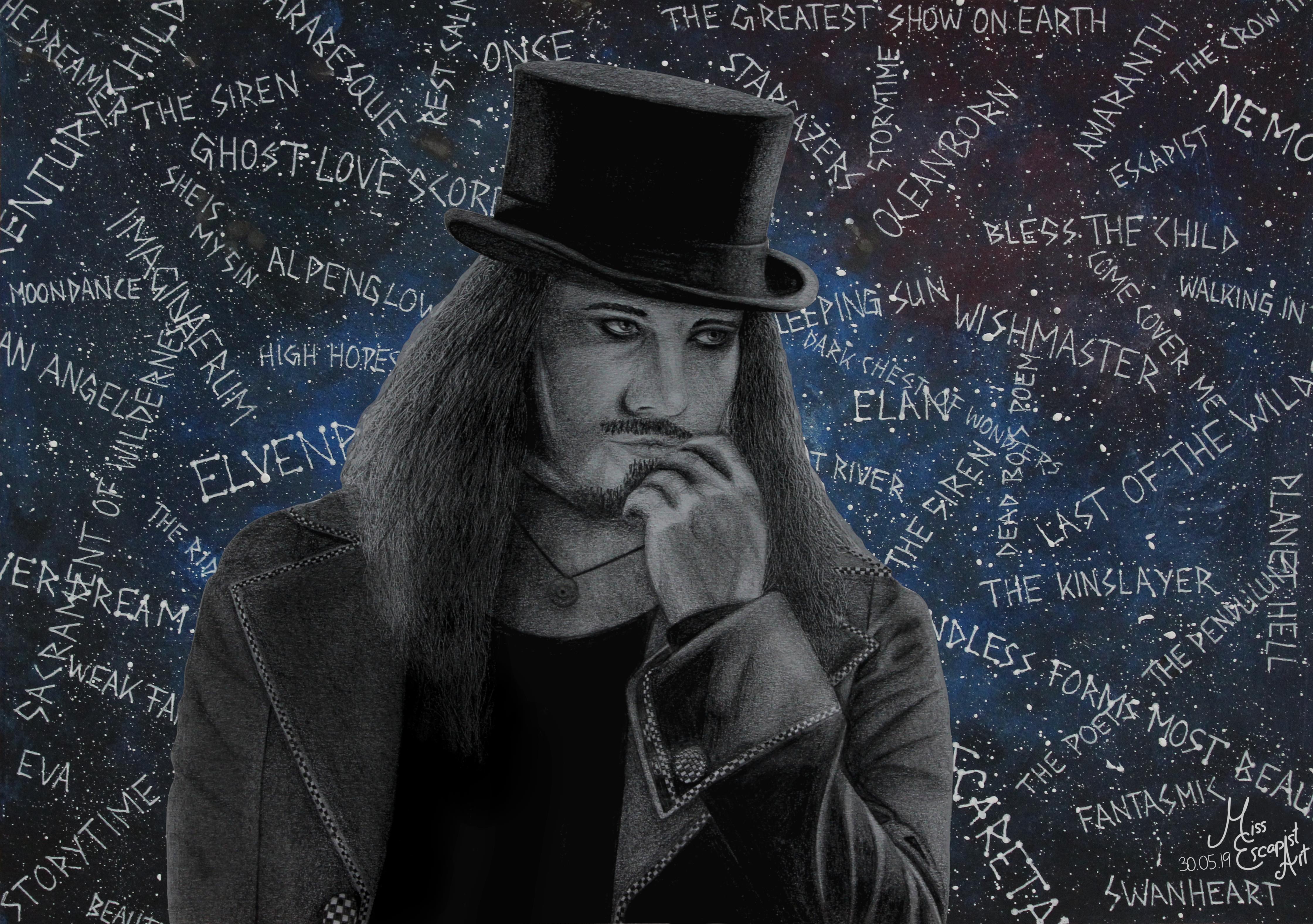
Now that I‘ve finally finished the Tuomas Holopainen card design, I can write a blog-post about the process of creating both – the Tuomas drawing itself and the card. I could have written something about the drawing before but as the two belong together, it just made sense for me to wait with this a little longer.
It all started with the idea of creating a new metal king card – for Tuomas. As I haven’t had any proper drawing to use for it, I decided it would be best to do a completely new drawing. I had found my reference photo quite quickly and my first intention was to start drawing with a ballpoint pen (as that had worked out for the cards quite well in the past). I started drawing Tuomas but stopped doing so somewhere in the middle of the process as it just didn’t look right in my eyes. So, I started all over again, this time with pencils. Suddenly, the drawing process got much smoother and I was way more satisfied with what I was creating there.
After having finished drawing Tuomas (which was pretty easy going after I had made the decision to use pencils instead of a ballpoint pen), I first intended to immediately start with designing the card. But as I liked the finished portrait so much, I wanted to “complete” it with a proper background. Instead of doing a realistic background drawn with pencils, I had the idea of adding something dreamier. I got out my acrylic colours and a separate sheet of paper and painted it in a bluish tone. I added sprinkles of white colour to give it a galaxy sort of look. Then, I used a gel pen to write the titles of some Nightwish songs on top of it all. Last but not least I cut out the Tuomas drawing and glued it onto the newly created “Nightwish galaxy” and done was the Tuomas Holopainen portrait.
I was pretty satisfied with the finished portrait and therefore didn’t really dare touching it again to create the card. Also, I was lacking inspiration and so it took me quite some time to get back to it. I started doing the design two or three times but stopped again because I didn’t like the result. One day at work I finally had the sparkling idea and couldn’t wait to transform it into a card as soon as I got back home. This time, the creation process only took a few hours as I already had the idea set in my mind. First, I edited the scan of Tuomas’ portrait into the required symmetrical form and added it to a blanc card. Next, I drew the pendulum symbol and the stardust using Autodesk Sketchbook. I changed their colour quite often, finally ending up with a purple tone that seemed to fit quite well. The last thing to add on top were the music notes and after a bit of finetuning and rearranging the card was done as well.
Materials: Faber Castell blacklead pencils, acrylic colours, white gel pen, Autodesk Sketchbook, GIMP
“When the dawn is bright and new And the day is full of hope It’s easy to continue your journey Like a king on his royal way”
Amorphis – Death of a King
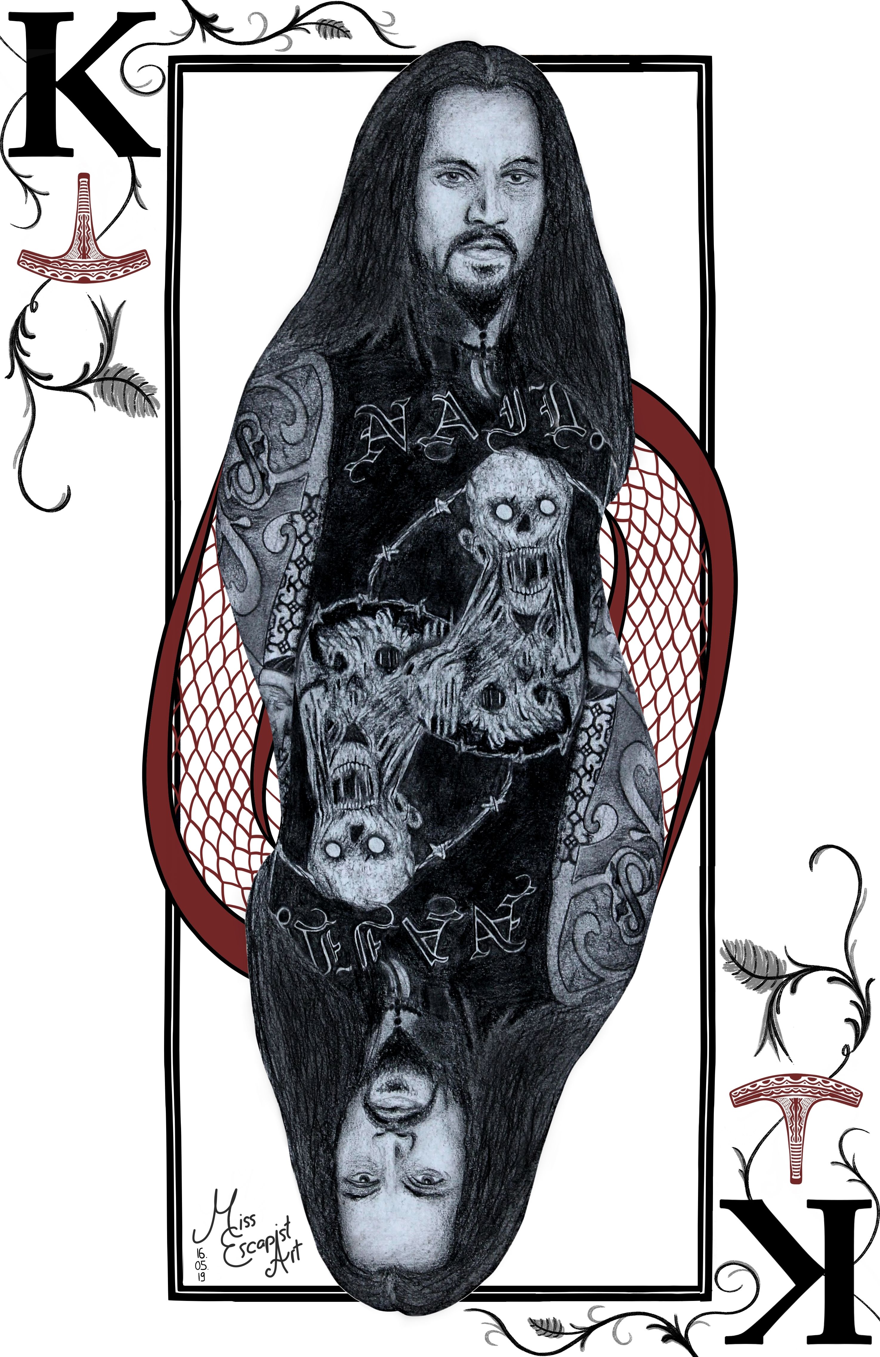
After
having drawn multiple metal queen cards, I felt like it was finally time to
give the male part of the genre some well recognition, too. So why not start a
metal king series? And I knew exactly who was going to be the first one to get
a card: Tomi Joutsen, singer of Amorphis. I had done a
portrait drawing of him last year and to me that drawing just seemed to fit
perfectly for a card design. Luckily, I had a good scan of the drawing on my
notebook and was able to start editing right away. First step was to erase the
background, as I didn‘t want it in the card. After that I went on with bring
the portrait into a symmetrical shape. It took me quite some time to figure out
how to do that most elegantly because I didn’t want the print on his shirt to
look cut off. Instead, I wanted the prints of each side to flow into each
other. When I finally had my symmetrical Tomi, I added him to the empty card
template. Now it was time for creativity work. I knew that the symbol I wanted
to use in the frame was Ukko’s hammer as it’s a symbol often found in Amorphis‘
works. Furthermore, as a little contrast to Tomi’s rather death metal like
appearance, I added some floral ornaments to the frame. The ornaments are also
referring to the album „Silent Waters“ where you can find a similar arrangement
on the album cover. I hoped it would emphasize the contrast often found in
Amorphis‘ music – the coexistence of heaviness and growls but also clear
singing and beautiful melodies. I was almost done with the card, but felt like something
was still missing. All other cards that I had done before have a colorful
accent found somewhere in the picture. I wasn’t really sure how to do that
here. After sleeping over it for a night, inspiration finally found me. On the
album cover of „Under the Red Cloud“, you can see a spiral pattern with a
texture that resembles snakeskin. So I drew a very similar arrangement to embed
Tomi. Colorwise, I wasn’t sure whether to pick a dark red or a more bluish
tone. After trying both, I decided to go with red. As a last and final touch, I
made Ukko’s hammer red as well. And there it was – the first metal king card.
Materials: Autodesk Sketchbook (+ Faber Castell blacklead pencils for the portrait)
Time: approx. 3 hours (only for the card design, drawing the portrait took 8 hours)
Reference photo used for the drawing was taken by: Lina Glasir
“No one can protect me. No one can protect anyone.”
Sansa Stark – Game of Thrones
With the
last and final season of Game of Thrones coming up it was about time to
dedicate another portrait to this series. I had wanted to draw Sansa Stark for
quite a while – despite the fact that I didn’t really like her in the
beginning, she grew to be one of my favourite characters. I remembered a
picture of her that I had seen a few weeks ago and that would make a wonderful
reference. After I had found that picture again, I started drawing right away.
First, I drew Sansa’s eyes, then I shaded the skin, slowly working out her nose
and mouth. After I was done with that, I continued with drawing her hair. Once
again, I used the metallic tip of my mechanical pencil to “indent” hair
structure into the paper before I started drawing over it with a regular pencil.
This method had worked out very well for me on the Cristina Scabbia portrait
and it also worked out here. The hair structure looks way more realistic and
detailed. I continued with drawing the background, before I started working on
the fur.
I managed
to finish the portrait in a surprisingly short amount of time, the complete
drawing process only took me about 8 hours – I started on a Friday afternoon
and finished it on Sunday. Just in time for the new GoT season…
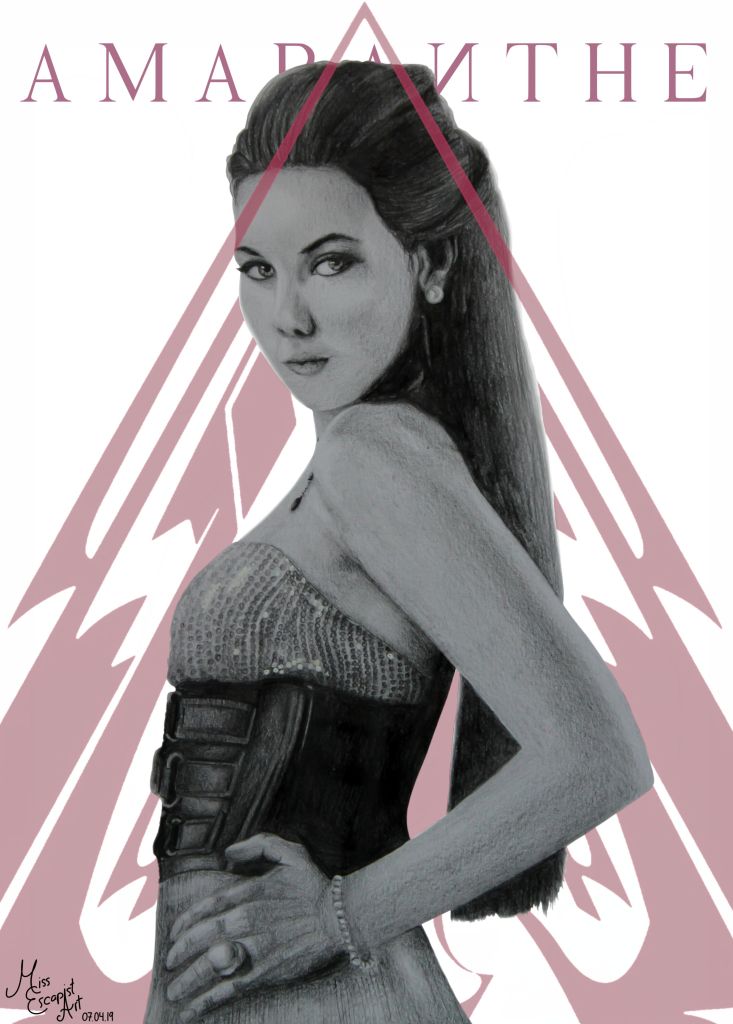
“And you can light the dark all by your own. So let us show the world our love is strong”
Amaranthe – Amaranthine
This one is a rather old portrait that I drew back in 2017. I never drew a background for this picture but always promised myself that I’d come back to doing so one day. That day happend to come two years later, when I finally felt like I had an idea on how to approach things. The Anders Fridén portrait had given me the final inspiration that I needed. So I took a proper picture of the old drawing and once again used my tablet to give it the final touch. I tried a lot of different colours for the logo, switching them back and forth, until I was finally happy with the result.
Paper size: A4
Materials: Faber Castell blacklead pencils, Autodesk Sketchbook
Time: approx. 12 hours (1 hour for the digital “upgrade”)
Reference photo used for the drawing: cover of the album “Amaranthe”
“So burn, burn, burn, the world needs to see with open eyes, let the flames be seen far and wide”
In Flames – Burn
What began as a classical pencil portrait started to become a mixed media piece in the end. I drew Anders Fridén with my pencils and the progress went without major struggles. When I had finished drawing Anders I felt like the picture could use a colourful splash in the background. As I wasn’t so sure about this approach though, I decided to leave the original untouched. So I scanned it and added the In Flames logo digitally – and ended up very happy with the final result.
Paper size: A4
Materials: Faber Castell blacklead pencils, Autodesk Sketchbook
Time: approx. 12 hours
Reference photo used for the drawing was taken by: Gina Wetzler
“Open your mind Then you will be Balanced and free”
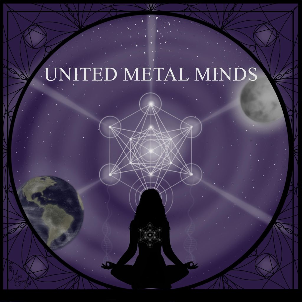
Epica – Beyond The Matrix
Shortly
after Simone’s birthday portrait I decided to give digital drawing another
chance – and created an illustration for Mark Jansen’s “United Metal
Minds” project. When I started
drawing, I didn’t have any concept for how I wanted the picture to look like. I
started off by colouring the background and drawing the United Metal Minds logo
in the centre. After that I continued with adding the silhouette of a woman
meditating, then I drew the moon and earth in opposite corners of the picture.
Last but not least, I added a sort of “mandala” frame to the image.
At first,
it was rather difficult for me to come up with ideas for the illustration as I
didn’t have any music to refer to and only a rather vague topic but I tried to
make the best out of it.
A few explanations
on the artwork itself: the logo in the center isn’t my own design, it depicts a
symbol called “Metatron’s Cube” – a reference for energy, motivation
and focus. The silhouette of the meditating woman is supposed to be a symbol
for the mind and the ability to focus on it.
The cube symbol resembles the “Flower of Life” symbol. If you look
closely at the woman’s hands you can see a DNA strand just above – as a symbol
for life and its origin. I was trying to connect two things with the used
symbolism – spirituality (=meditation) and science (=DNA strand) – as I think
both can strongly define your view on the world. The moon and earth symbolise
connection, interaction and also life. The frame, once again, is a mandala to
adapt to Metraton’s Cube in the centre of the illustration.